Heat Maps: What they are and how this tool transforms Sanitation Management
What is a heat map?
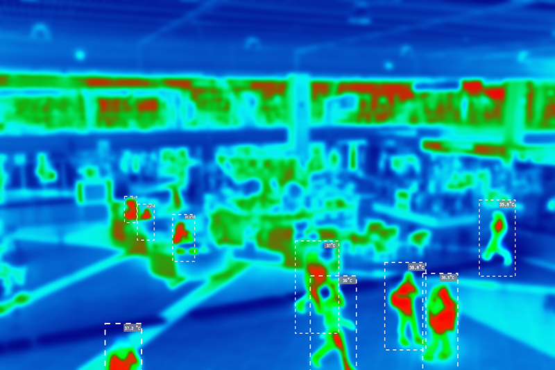
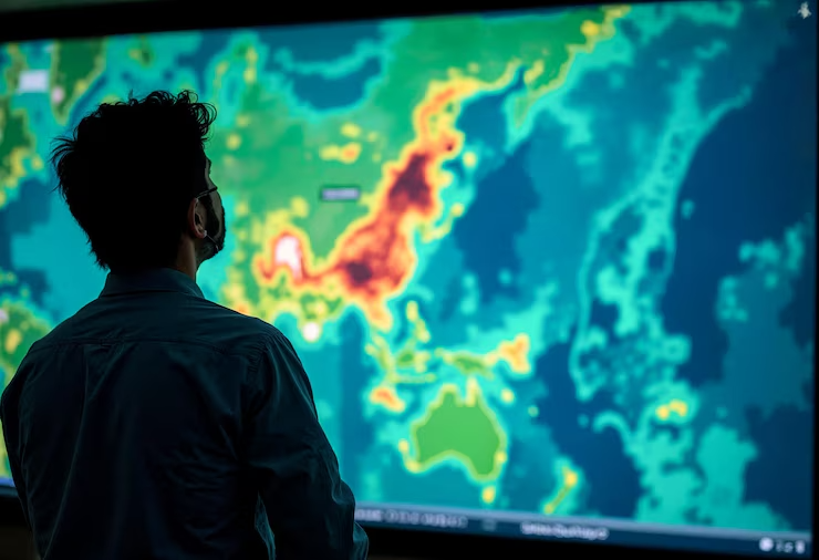
THE heat map It is a visual way of presenting data on a territory or surface, which uses color scales to highlight intensities, patterns, and concentrations.
Instead of requiring the reading of lengthy tables or reports, a heat map facilitates a quick understanding of where something is happening with greater or lesser intensity.
This tool is widely used in areas such as marketing, public health, urban security, logistics, mobility, and economics.
This is because it makes visible trends that would otherwise remain hidden in spreadsheets, such as demand peaks, risk areas, behavioral patterns, or occurrences concentrated in a specific geographic location.
Here are some examples:


Why has this tool gained traction in sanitation?
As industries began to deal with increasingly larger volumes of data, heat maps became indispensable for operational analysis.
In water distribution, there is a constant challenge: How to make quick and assertive decisions in large systems with thousands of variables?
This is where heatmaps become important, as they allow you to see the behavior of the network in an integrated way.
How heat mapping is applied in sanitation.
In sanitation, the heat map highlights regions operating normally as well as points showing signs of anomalies, such as leaks, mixing of sectors, water shortages, very low pressure, or unexpected increases in hydraulic loads. The system identifies these points based on patterns pre-established by the Loss Management System.
Practical application occurs primarily in four areas:
1. Identifying supply behavior
The map displays pressure data for the sector using colors, contour lines, and Hydraulic Load (VMN). This allows for quick visualization of where the water supply is within standard parameters and where it is not.
2. Detection of areas with anomalies
The colors highlight areas with very low or very high pressure, while the alarms generated by these variations indicate the urgency of the situation.
3. Prioritization of critical areas
By highlighting the most impacted regions, teams can prioritize where to work first. This way, inspections, maintenance, and checks are directed to the most critical areas.
4. Monitoring the evolution of the sector
By comparing maps from different dates, we can verify whether an anomaly has been resolved or even worsened during this period. This historical analysis helps to validate interventions and predict operational trends.
Heatmaps combined with artificial intelligence
With the advancement of Artificial Intelligence (AI), heat maps are becoming a predictive tool. AI allows us to identify:
- anomalies before they become real losses
- areas with high potential for leaks
- trends that are not perceptible through human analysis alone.
This combination enhances the teams' ability to act proactively, which reduces costs and increases control over the network.
Final considerations
As progress Legal Framework for Sanitation As water conservation and sustainability goals become more urgent, understanding supply behavior has ceased to be merely an operational task and has become a necessity. Heat maps reduce uncertainties, accelerate diagnoses, and transform pressure data into practical decisions.
It is in this context that the Ada Module, The Stattus4 system is gaining relevance. It uses Artificial Intelligence to interpret pressure data, identify irregular patterns, and generate alarms.
In this way, heat maps cease to be merely a visual representation and begin to directly support preventive management and operational efficiency.
To delve deeper into the topic and see practical application examples, access the complete eBook: Heat Maps in Sanitation: From Theory to Application